|
|
Down loading, copying, printing, or any other form of reproduction is strictly forbidden unless written consent has been granted by the copyright holders. |
|
Illustration is the art of telling stories with pictures. In this brief tutorial I go over a few basic points of this art.
-Focus
• Leading the viewer's eye through an image is the fundemental challenge of pictorial storytelling. Just as it is difficult to hear more than one person speaking at a time, it is difficult to focus on more than one element in a picture at a time. In music, it's called a Theme, in literature it's called a Plot. More than one theme or plot in a single work creates a muddle. In picture making these elements are the Focal Points. In order to make your images cohesive and ledgible it is always best to limit your pictures to one Focal Point, or main center of interest. There may be many elements in a painting, but the Focal point is usually clear.
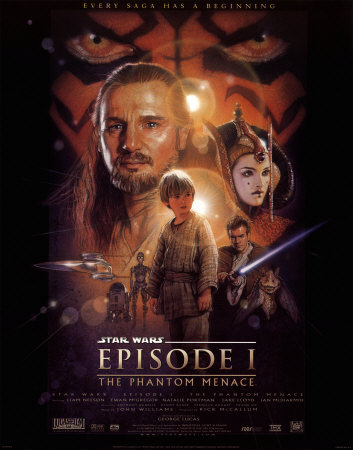
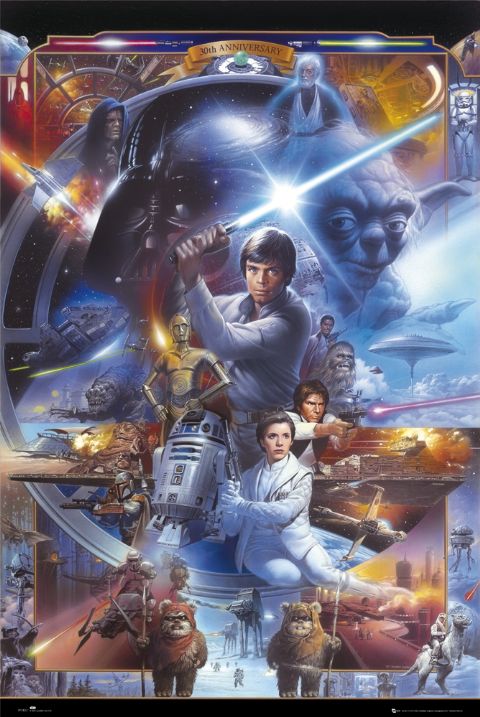
In these two examples of Star Wars posters we see the right way to show multiple subjects and the wrong way. You be the judge as to which is which.
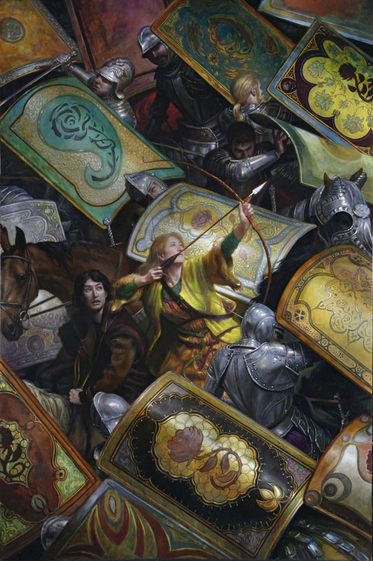
In this image by my colleague Donato Giancola we see an extremely busy composition with many elements. However, the artist has arranged the elements in such a way that the Primary Focal point is clear, and the design is cohesive.
Emotional Narrative • Implying emotion has a far greater impact than simply showing it outright. Happy people don't need to be laughing, angry people don't need to be gnashing teeth. The use of body language is crucial.
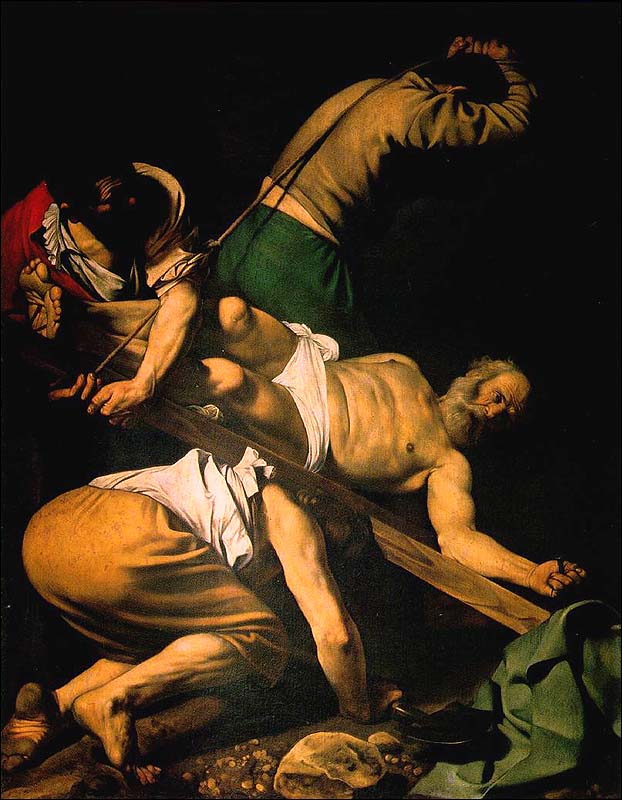
In this image we see the famous "Crucifixion of St. Peter" by Carravagio. The only face that is shown is that of St. Peter. His executioners are anonymous workers with dirty feet and cheap clothes. In this simple narrative Carravagio makes the workers sympathetic, just poor men doing a job they don't like, hiding their faces in shame, while Peter's expression shows compassion and forgiveness.
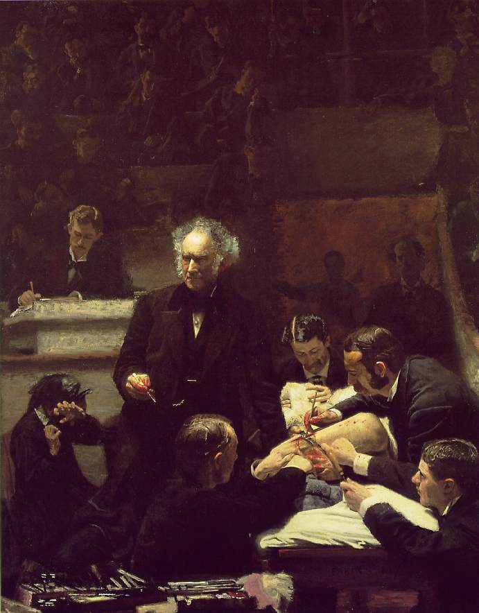
In "The Gross Clinic" by Thomas Eakins, the placid ghost-like faces of the students and Dr. Gross are in stark contrast to the contortions of pure anguish of the woman in the lower left. Those hands make the whole painting.
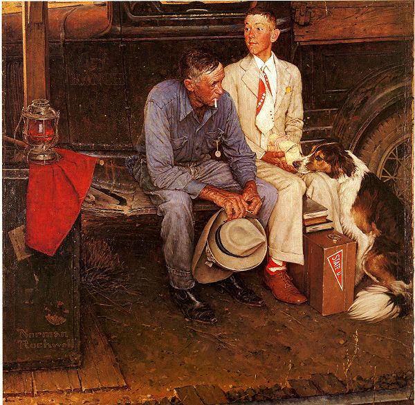
In what I regard to be Rockwell's best illustration "Breaking Home Ties", there are a multitude of emotions going on. The rigid excitment of the boy watching down the tracks for the approaching train with new suit and face and hands scrubbed clean. He cradles the pink-ribboned lunch like holy communion, knowing its the last meal from his mother. Contrasted with the rough, haggard, down cast face of the stoic father who refuses to watch, to speak, to show emotion, but nervously fingers his son's new hat with calloused hands. Even the iconic dog adds to the drama. The emotional narrative forces us to decipher the story.
-Staging • In studying drama I learned the importance of staging. This encompasses the arrangement of the figures and elements in an image to tell the story. Just as in cinematography and drama, It is not always necessary to face the characters in an image "downstage". This always makes figures look posed and somewhat like a tableau. For a more natural image characters looking "offstage" helps create the effect that there is a world beyond the borders of the image. This technique has been used since ancient Greece. Shakespeare described whole battles in the wings that had to be imagined by the audience.
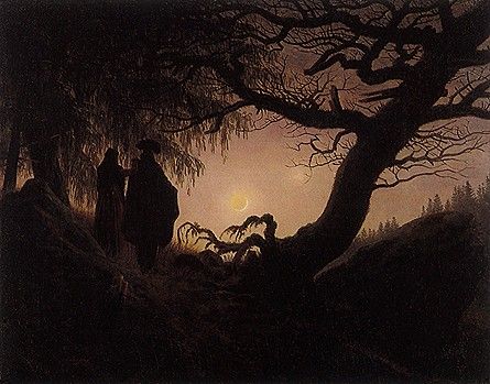
David Caspar Friedrich is an excellent example of staging. He routinely turned his figures backs to the viewer, this allows the viewer to feel involved with the image, and try to follow the character's sightline deeper into the painting.
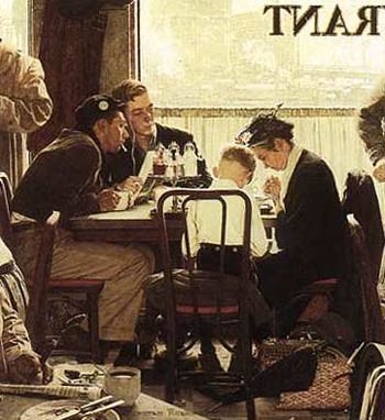
In "Saying Grace", we see Norman Rockwell use staging expertly to crop many of his foreground figures like a candid photograph taken from an ajoining table. From the gnarled fingers holding the cigar in the extreme foreground, to the soot covered landscape out the window, and the smoke filled room in between, all inform the viewer of a complex and textured world populated with real people. The emotional narrative becomes poingant without any emotional display. Note Rockwell's use of sightlines as well. The young men's intense gazes focuses the attention in the busy room squarely on the quiet pair praying.
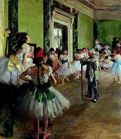
Degas was a master of staging his characters in order to tell his stories. In "The Dance Class" he arranges his ballerina's around the master like planets orbiting the sun. The figures all identicle in appearance and yet individual in their body language, like dolls in a collection.
-Spacing
• The use of space in a painting is like the use of punctuation in literature or the tempo in music. This falls universally under the heading of composition and anyone intersted in becoming a visual artist should study composition in-depth.
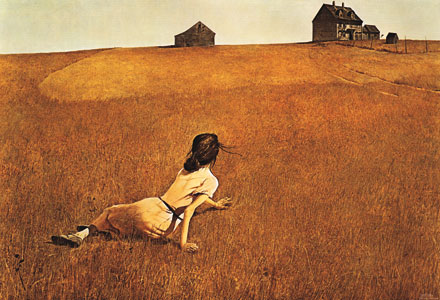
In this example of "Christina's World" by Andrew Wyeth, the use of space and staging is masterful. Christina is small relative to the composition and she is drowning in the oppressive open space that looms around her. Even her pose is reminiscent of swimming. She struggles in a sea of grass to reach the island of her house on the horizon. Although the figure is turned away an entire emotional narrative is described.
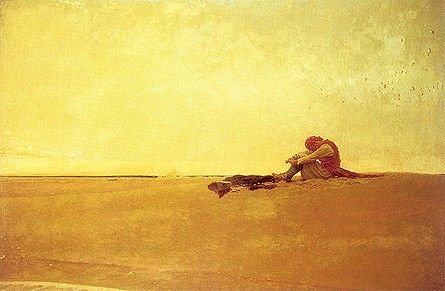
In this example by Howard Pyle, "Marooned", the use of oppressive space and scale is harmonious. While the vast open space makes the figure look lost, the slab-like sky literally bends the figure into dispair under its weight and the character's narrative is illustrated without any facial expression.
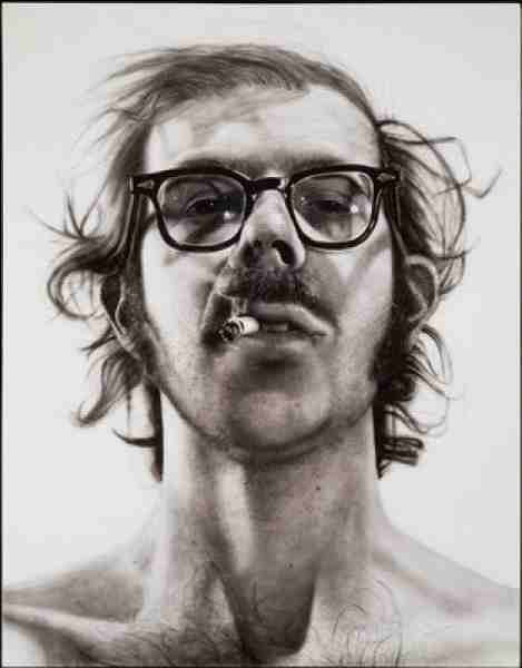
In contrast, Chuck Close's "Self Portrait" is uncomfortable in its closeness revealing all the flaws of the individual engaging the viewer in an unflinching stare.
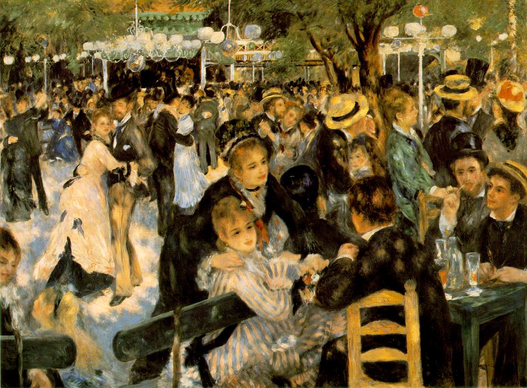
"Le Moulin de la Galette" by Renoir shows the use of cluttered and frenetic space to enhance the swirling sensation of a dance hall. Adding the dappled sunlight creates a strobing effect.
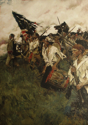
Howard Pyle demonstrates the the uplifting effect of space below the subject. In "The Nation Builders" he creates the effect of the figures climbing stairs, or the prow of a ship plying through water with the general as its masthead.
Color • The use of color in a painting is like the use of vocabulary in literature. Color produces mood and emotion. Warm colors vibrate and advance while cool colors are restful and recede. Bright colors are loud while gray colors are literally and suggestively muted. Artist Wassily Kandinsky assigned all colors an instrument in the orchestra to codify this relationship in his treatise "Concerning the Spiritual in Art". Using this to advantage is very important when describing characters and enviroments.
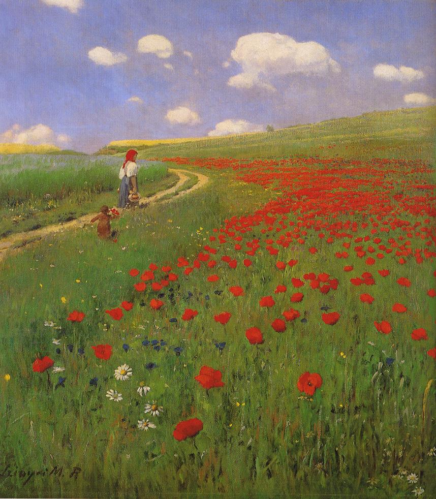
In this painting by Merse we see how color can be used as a compositional element. The red swath of flowers leads the viewer's eye directly to the red kerchief on the woman's head.
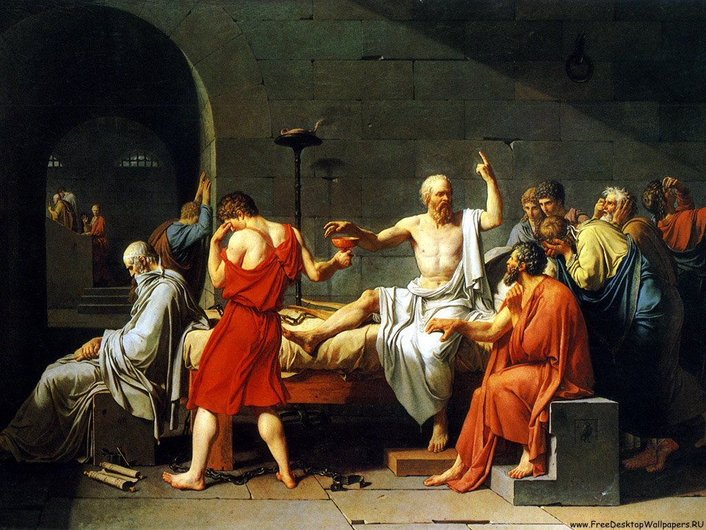
Color is used narratively by David in "The Death of Socrates". The boy holding the cup of poison wears blood red, while socrates himself wears pure white.
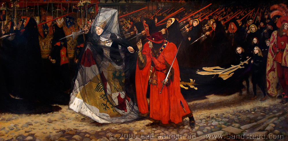
"Richard, Duke of Gloucester, and the Lady Anne" by Edwin Austin Abbey is one of my favorite paintings. Note the strategic use of red to convey danger and draw the viewer's eye through the complicated image in the verticle stripes of the halberds.
(Do as I say, not as I do.)
|